it's october y'all. you know what that means.
SPOOKY SCARY SKELETONS 🕺🏻
CSS Animation Effects (wishlist)
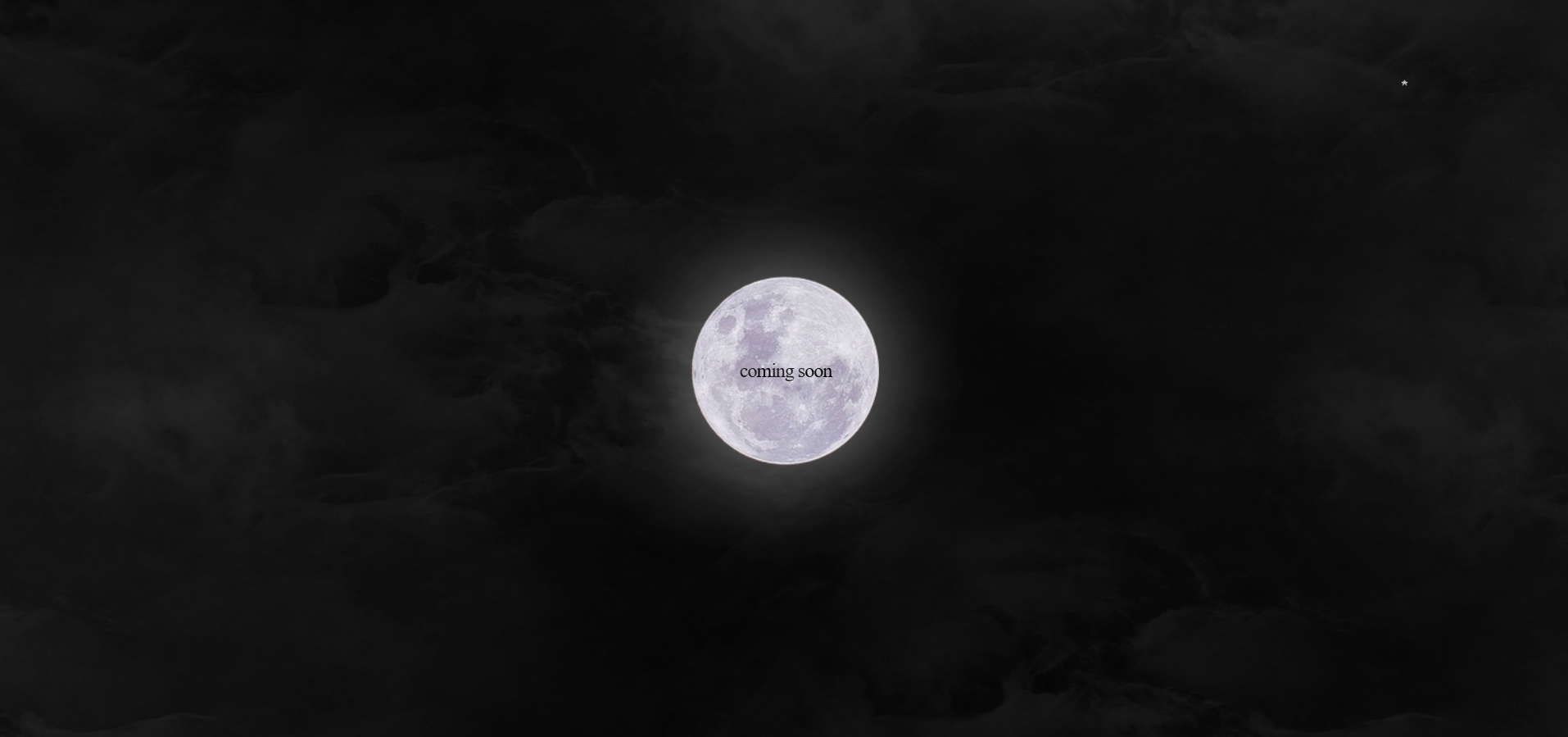
Table of Contents
1 Intro
Hi Anon! Thank you for asking about the animations used in this design and how to recreate, instead of just copy-pasting! <3 I hope this tutorial will give you the explanation you need - if not, let me know!
2 Animation: Text fading in and out
I used the <b>-tag to animate certain parts of the words "coming soon", so the words would fade out to leave the word "moon". The following will show you how!
This is what's inside the <style>:
b {
	font-weight:lighter;
	animation:comingsoon 6s infinite alternate ease-in-out;
}@keyframes comingsoon {
0% { opacity: 1; }
100% { opacity: 0.2; }
}To finally create the specific way to write the word, you have to:
<b>co</b>m<b>ing s</b>oon3 Animation: Moving clouds in the background
This is, again, inside the <style>-Element.
#clouds {
position:absolute;
overflow:hidden;
z-index:1;
width:100%;
height:100%;
background-image:url('clouds.png');
background-position:0px 0px;
background-repeat:repeat-x;
animation:clouds 180s linear infinite;
transition-delay:1s;
opacity:0.5;
}
@keyframes clouds {
from { background-position: 0 0; }
to { background-position: 5000px 0; }
}<div id="clouds"></div>4 The full code
All of the code put together would look like this:
<!doctype html>
<html>
<head>
<title>coMing sOON.</title>
<meta charset="utf-8">
<link rel="icon" href="https://designfreaks.net/placeholder/100x100?bgcolor=000&txtcolor=fff&text=.&fontsize=150" type="image/png">
<style>
* {
margin:0;
padding:0;
border:0;
outline:0;
box-sizing:border-box;
}
::selection { color:inherit; background:transparent; }
body {
color:black;
font-size:24px;
font-family:times new roman;
letter-spacing:-1px;
background-image:url('background.jpg');
background-size:cover;
background-position:center;
background-repeat:no-repeat;
height:100vh;
cursor:url("cursor.png") 0 0, auto;
}
b {
font-weight:lighter;
animation:comingsoon 6s infinite alternate ease-in-out;
}
#clouds {
position:absolute;
overflow:hidden;
z-index:1;
width:100%;
height:100%;
background-image:url('clouds.png');
background-position:0px 0px;
background-repeat:repeat-x;
animation:clouds 180s linear infinite;
transition-delay:1s;
opacity:0.5;
}
@keyframes clouds {
from { background-position: 0 0; }
to { background-position: 5000px 0; }
}
@keyframes comingsoon {
	0% { opacity: 1; }
	100% { opacity: 0.2; }
}
main {
position:relative;
z-index:2;
height:100%;
width:100%;
display:flex;
justify-content:center;
align-items:center;
}
</style>
</head>
<body>
<div id="clouds"></div>
<main>
<b>co</b>m<b>ing s</b>oon
</main>
</body>
</html>